Jehova, More Than A Name
Challenge:
Create an educational publication that explores the theological significance of God's names while generating meaningful engagement and a call to action, transforming complex biblical content into an accessible, visually cohesive learning experience.
Strategy:
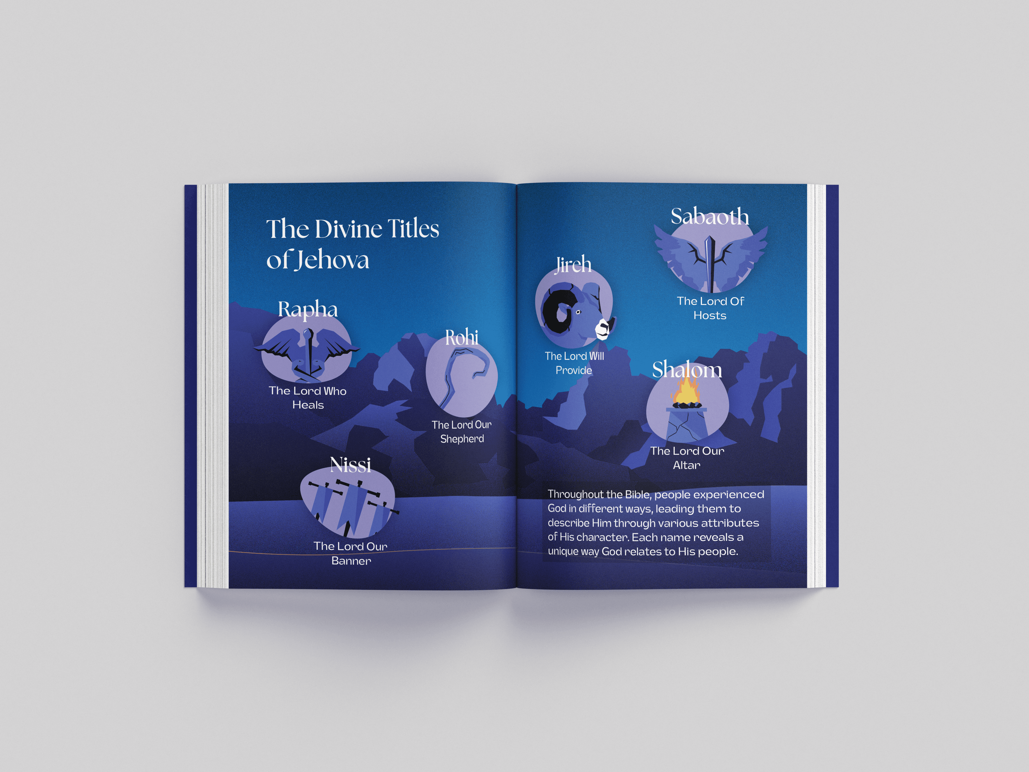
Developed "Jehovah: More Than A Name" as a journey through biblical narrative, anchoring the entire design around the iconic burning bush from Exodus 3:14—the moment God reveals "I AM WHO I AM." Used this powerful visual motif as both a storytelling device and unifying design element to guide readers through the exploration of divine titles and their personal significance.
Creative Execution:
Designed a complete publication featuring a dramatic twilight color palette of deep blues, purples, and warm flame yellows that evoke both reverence and approachability. Created custom illustrated icons representing each divine title (Rapha, Jireh, Rohi, Nissi, Sabaoth, Shalom) with symbolic imagery—medical symbols for "The Lord Who Heals," shepherding for "The Lord Our Shepherd," and altar imagery for "The Lord Our Altar." Implemented elegant serif typography for headers paired with clean sans-serif body text to balance traditional religious gravitas with modern readability. Carried the burning bush illustration across multiple spreads as a narrative thread, creating visual continuity while exploring different facets of God's character. Concluded with "What This Means for You" and "Beyond the Name" sections that transform historical-linguistic study into personal reflection and actionable faith practice, successfully achieving the educational and inspirational goals of the project.
Type
Branding
Date
Spring 2025