Popular Mechanics Magazine
Challenge:
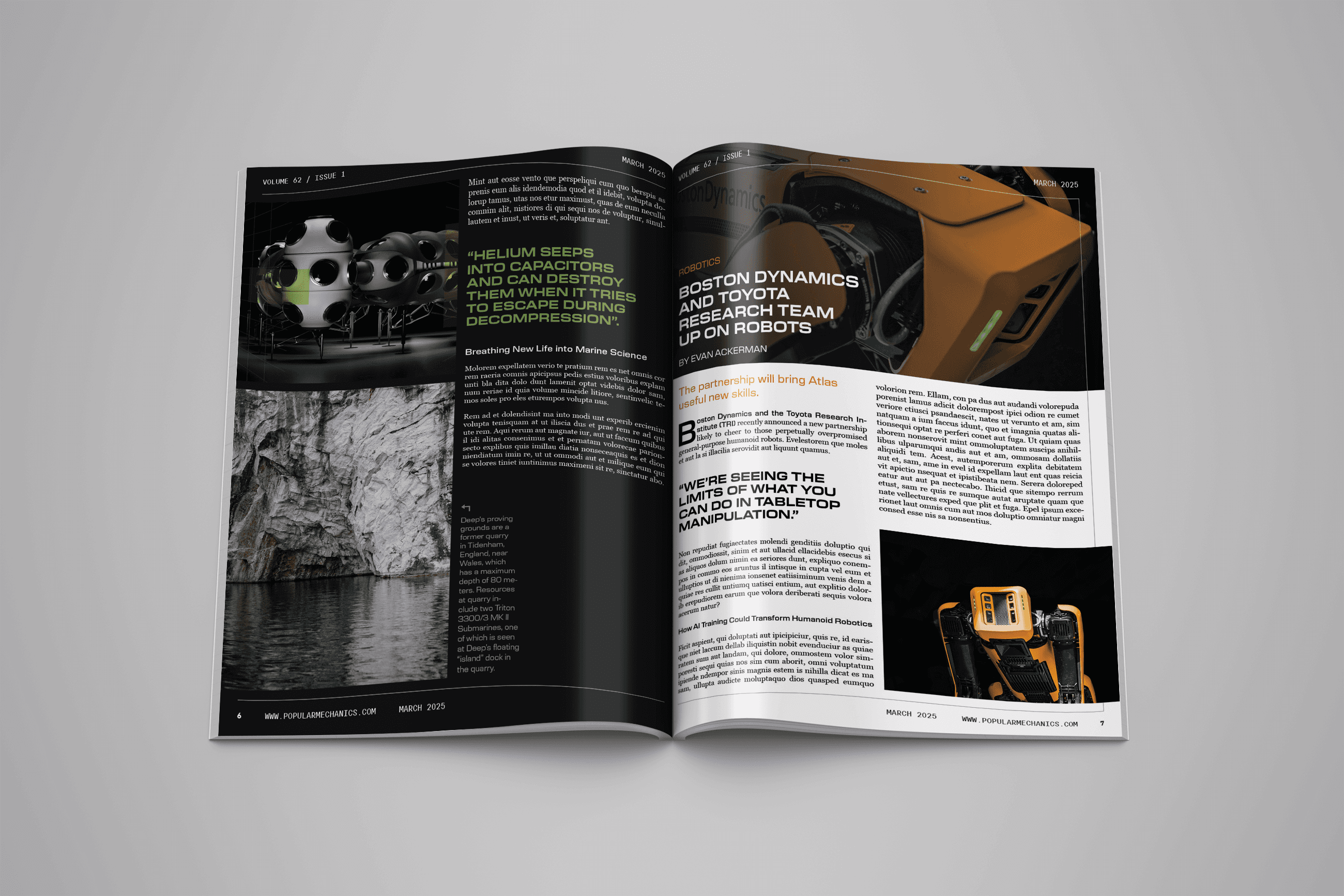
Redesign an article from Oceanography Magazine as if it were published by Popular Mechanics, maintaining editorial integrity while adapting content to match Popular Mechanics' distinctive visual style and audience expectations.
Strategy:
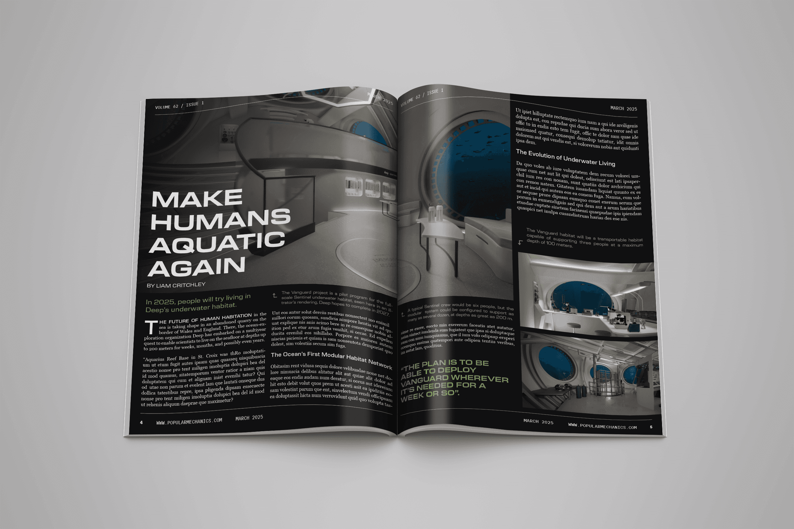
Translated "Make Humans Aquatic Again" - a technical article about underwater habitation - into Popular Mechanics' bold, accessible design language. Focused on creating visual hierarchy that appeals to PM's tech-enthusiast readership while preserving the scientific depth of the original content.
Creative Execution:
Developed a complete magazine layout featuring dramatic split-water cover photography, clean editorial pages with strategic use of pull quotes, and a modern typographic system combining bold headlines with readable body copy. Implemented PM's signature design elements - including vibrant accent colors (green), strong imagery, and technical callouts - to transform dense scientific content into engaging, scannable spreads that maintain journalistic credibility.
Type
Advertising
Date
Spring 2025